The
quality of Bob Dylan’s creativity and his
productivity were outstanding in the mid-Sixties. The three LPs, Bringing It All Back Home, Highway
61 Revisited and Blonde on Blonde,
’65-’66, constitute his very best work.
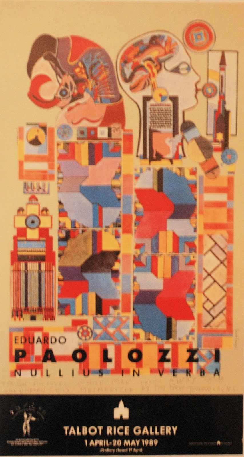
Compare Eduardo Paolozzi and his printmaking, ’64-’67: As Is When,
Moonstrips Empire News and Universal Electronic Vacuum –
masterworks all, embodying quality and quantity.
Moonstrips is a portfolio of 98 screenprints-
8 of which are signed/numbered – presented in a Perspex box. The prints are 380mm x 254mm. Additional sheets included in the box are a
title page, colophon and introduction by Christopher Finch. Printing was by Kelpra Studio and the box was
made by Herault Studios. The Portfolio
was published in 1967 in an edition of 500 by Editions Alecto.
In As Is When Paolozzi invited the viewer
to make both visual and linguistic connections, based on their own unique
experience and knowledge, between many disparate component images and
text. Here Paolozzi was developing the
ideas of Marcel Duchamp, an early pioneer of shifting the balance of activity
from the artist towards the viewer.
Duchamp classified most art as being intended only to please the eye
(‘retinal art’); his mission was to ‘put art back in the service of the mind’. In Moonstrips
we can enjoy this latter objective being achieved whilst being fully indulged
retinally at the same time.
In
Duchamp’s Green Box - 1934 – notes
about his Large Glass and other
related experimental works are presented in a box, unbound – leaving it to the
viewer to determine the order of their consideration:
Moonstrips follows the same principle, constituting what Paolozzi
thought of as a ‘terrestrial image bank’.
Regarding
language and its relationship to thinking, Paolozzi’s writing activity
developed in summary as follows:
In
notes from a lecture at the ICA, 1958, he used words as units in a verbal
collage
Metafisikal Translations (1962) – words/phrases were strung
together to create a meaning larger than the component parts. Spellings were played with and typefaces
varied in order to enhance ambiguities
Wild Track for Ludwig- a text included in As
Is When –is characterised by the use of found fragments of writing and its
composition/editing by a semi-spontaneous method
Kex (1966)
collage novel. In this Paolozzi ceded
control of the final output by delegating editing and layout to Richard
Hamilton
Mnemonic Weltschmerz with probability transformations – the text in Universal Electronic Vacuum – was
rendered with no sections/paragraphs
Moonstrips – words were used as units in themselves, often as a
self-sufficient idea-image. Moonstrips was much more experimental
with typography and layout. Material was
derived from a vast number of sources
However,
in this blog I want to concentrate on the visual image sheets - there are no
less than 55 of them to enjoy!