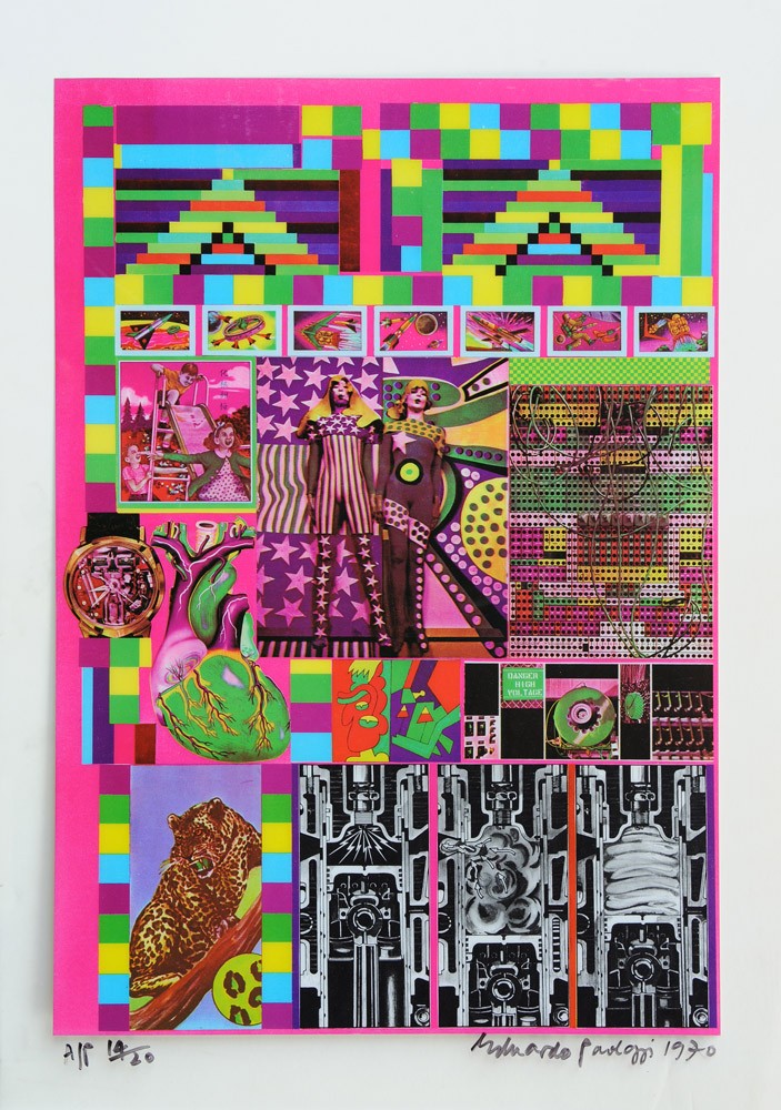
Sunday, 21 February 2016

50 Years on and back in Albemarle Street


I have been a fan of Paul Smith’s sumptuous ties and socks for years.  Long ago I had a wonderful pair of stripy socks, looking rather akin to a 425 line tv screen suffering from, (maybe alien-transmitted from deep space), interference, which I referred to as my Eduardos.  So I was especially pleased to find this collaboration between the Designer and Emma Paolozzi:

Courtesy of Paul Smith


I’m only sorry that I was unable to get to London for this event last October.  It was at 9 Albemarle Street – I would have enjoyed the added nostalgia factor that this street was the location of the Editions Alecto gallery which I frequently visited in the Sixties.

Sunday, 7 February 2016

The Subject is S.I.N.

I have always much preferred Paolozzi’s graphic work to the sculpture.  It is true, however, that it is the latter that has received the most general acclaim.  And some of the oeuvre – the Tottenham Court Road mosaics, ‘Four Towers’ and ‘Hamlet in a Japanese Manner’ for example – straddles the media.

(Part of) Hamlet in a Japanese Manner      Courtesy GoMA 

Of the sculpture, some of the Sixties works appeal to me as they relate directly to – and have the same ‘look’ as - the great prints, such as, ‘Wittgenstein at Casino’. 

Later in his career, Paolozzi became very interested in Sir Isaac Newton and William Blake’s monotype of him.  In the various versions Paolozzi succeeded in expressing the reality of human thinking, whereby apparently contradictory notions can – indeed, HAVE – to be accommodated.  Blake, from a traditional religious viewpoint disapproved of the Newtonian quest to scientifically account for the world, (in the Wittgenstein sense), and rendered him as myopic, whereas Paolozzi’s Isaac, in the version at the British Library in London, has Michelangelo’s David’s all seeing eyes. 

But I remain convinced that Eduardo should have stuck to printmaking – just look, below, at what happened when he was in the role of the sculptor - a suit (!) and . . . !
Courtesy Frank Thurston

Sunday, 24 January 2016

Paolozzi Revealed

I have just finished reading Ann Shaw’s Paolozzi Revealed.  It’s an account of Paolozzi’s 10 day 1996 ‘masterclass’ in which 18 people participated.  Ann herself seems to have ‘got’ Paolozzi eventually, though there was clearly some animosity, especially because of an incident on the last day when he gave her a verbal dressing down in front of the class. 

Ann’s record of the ‘event’ has an ongoing theme wherein the ‘students’ feel dissatisfaction with the lack of instruction/direction by Paolozzi.  Coupled with his apparent lack of manners – what we’d now call ‘interpersonal skills’ – the Artist is portrayed as antipathetic, hostile even. 

It is said that the most technically gifted footballers cannot be good coaches because of a lack of patience: they just can’t understand why their pupils are unable to perform with the brilliance they themselves do.  And with Paolozzi you have a man who has spent a lifetime building up ideas/concepts and repositories of objects and imagery – component materials with which he is ready to work in novel and refreshing ways at the drop of a hat.  Little wonder that he was frustrated by a group of mature ‘students’ who seemed to be wanting to be told ‘what to do’! 

Paolozzi told the group that they would ‘learn’ by an osmosis-like process facilitated by being in his company.  That seems entirely logical.  All that is unfathomable to me is why Paolozzi would have agreed to conduct the masterclass at all – I can’t see what was in it for him. 

Incidentally, in response to Paolozzi’s suggestion that the class goes to the library to read what’s been written about him, Ann says that he hadn’t written much himself.  That’s not so – for starters you’ll be more than a day or two working your way through the book, Eduardo Paolozzi: Writings and Interviews edited by Robin Spencer.  This book alone will tell you far more about Paolozzi than the recent monograph by Judith Collins which Ann advocates: it is a disappointing book for its superficiality and absence of fresh insight and interpretation of Paolozzi’s ideas and imagery. 

Ann’s account is fascinating and the photographs add immediacy.  If you already ‘know’ Paolozzi you won’t learn much you don’t already know, but it will add what used to be referred to in painting classes at my Sixties Art Schools as ‘local colour!’.

Sunday, 27 September 2015

The Portfolio and Conclusion


Just to round things off, here is the portfolio box in which the Z.E.E.P. prints were presented:


So that’s it.  In this blog I’ve covered all Paolozzi’s significant print media work of the Sixties.  I believe this has provided a view of a truly great artist at the peak of his powers – innovating, experimenting, challenging his own creative processes and the technical limits of the media. 

Paolozzi continued to create prints through the succeeding decades, but, to my mind never again with the success he achieved with his Sixties oeuvre.  Fifty years on I believe the work is as fresh and relevant as ever.

Sunday, 6 September 2015

Human Fate and World Power


Last of the six prints in the Z.E.E.P. suite is Human Fate and World Power:

I find this one very forward-looking.  As the twentieth century drew to its conclusion, society radically – and quickly - changed, became fragmentary, as mass communications media and easily facilitated transportation eroded mono-cultural societies. 

And notice that in the blue background field two of the things – the car and the aeroplane - that have hastened the fragmentation of human experience are themselves rendered as fragments. 

Symbolising the ‘old’ model of the world, the Fitch vault key looks a bit pathetic – will such simple technology continue to enable the safekeeping/security of people, ideas, culture, information in the new world?  Clearly not.  Indeed by the twenty first century we will have laws forcing authorities to release information that previously was so closely guarded.

A parrot can speak and imitate human vocalisation, but – like a computer – not know why it’s doing it - discuss.

More of the day, rockets, submarines and fighter planes, (even comical ones), were reasonable images to portray the currency required for world power – how different today in the context of asymmetrical combat and the notion of ‘war on terror’. 

The Sixties and the Seventies were decades when human fate did seem to rest on the machinations of a ‘cold war’ between two world superpowers – the U.S. and the U.S.S.R.  Looking back they now appeal, ironically, as settled times – it was basically a stalemate and a related conflict, which would indeed decide the fate of the human race, was always unlikely.  How different today.

Tuesday, 18 August 2015

Pacific Standard Time

(Back to Z.E.E.P.) Just some thoughts:

Two ziggurats in the top section.  The ziggurat temple format, with its ‘stepped’ profile, originated in the Middle East around 200–500 AD. Following a long wait, they suddenly became very trendy again in the Sixties!  Major exponent was Joe Tilson with a series of Ziggurat images during the course of the decade, e.g. Ziggurat 5, screenprint 1966:


Heart beating, watch ticking, cylinders firing.  In 1969 it was becoming possible to anticipate the reality of a blurring of lines between organic and mechanical/electronic functionalities. 

In the new world of funky science, will a leopard be able to change his spots? 

Yes, Man is in space, but, happily, children still like to play very simply.

The delightfully garish version of Pacific Standard Time shown below is an Artist’s Proof:

One of these is currently (Summer 2015) available at Goldmark for £1,850.

Tuesday, 11 August 2015

Home and Away


Here I am, the number one Paolozzi maniac in East Kent, and only by chance this morning did I discover the Home and Away exhibition at the Beaney in Canterbury.  I’m not sure how I missed being aware of this show – it’s been running since May 9th and features a fantastic array of the General Dynamic F.U.N. prints.  It’s especially good to see the prints at first hand again and their manner of display – they’re not formally framed and have the ‘look’ of something still being proofed.  From the ‘context’ exhibits I was also surprised by the fact that I’d forgotten about the original J G Ballard introduction to the Suite: 

The marriage of reason and fantasy which has dominated the 20th century has given birth to an even more ambiguous world.  Across the communications landscape move the spectres of sinister technologies and the dreams that money can buy. Thermo-nuclear weapons systems and soft-drink commercials coexist in an overlit realm ruled by advertising and pseudo-events, science and pornography. In ‘Moonstrips Empire News’ Eduardo Paolozzi brilliantly explored the darker side of this mysterious continent. By contrast, in ‘General Dynamic F.U.N.’ he brings together the happiest fruits of a benevolent technology. The leitmotif is the California girl sunbathing on her car roof. The mood is idyllic, at times even domestic. Tactile values are emphasised, the surface pleasures to be found in confectionary, beauty parlours and haute couture fabrics. Children play in a garden pool, a circus elephant crushes a baby Fiat. Varieties of coleslaw are offered to our palates, far more exciting than the bared flesh of the muscle men and striptease queens. Mickey Mouse, elder statesman of Paolozzi’s imagination, presides over this taming of the machine. The only factories shown here are manufacturing dolls. Customised motorcycles and automobile radiator grills show an amiable technology on its vacation day. Despite this pleasant carnival air, a tour de force of charm and good humour, Paolozzi’s role in providing our most important visual abstracting service should not be overlooked. Here the familiar materials of our everyday lives, the jostling iconographies of mass advertising and consumer goods, are manipulated to reveal their true identities. For those who can read its pages, ‘General Dynamic F.U.N.’ is a unique guidebook to the electric garden of our mind. 

I think that’s brilliantly concise and illuminating. 

If you’re in the South East, and – as I was up to today – unaware that such an image-feast is on offer, get a move on – the show closes on 23rd August.  http://www.canterbury.co.uk/Beaney/whats_on/Home-And-Away.aspx